
From Idea to Online Store: How We Built the UPS-AKB Website
When the founders of UPS-AKB approached us, they already had examples of websites they liked. However, the company itself was just getting started, and there was no definitive answer yet to the question: “What should our website look like?” We needed to determine how to present a technical product range, help visitors choose the right equipment, and provide a convenient way to contact the team or place an order.
We started by discussing the business goals and the needs of future customers. Some visitors need to quickly find a specific UPS or battery based on technical specifications. Others need help selecting a solution based on load requirements and desired backup time. The website had to work equally well for both groups.
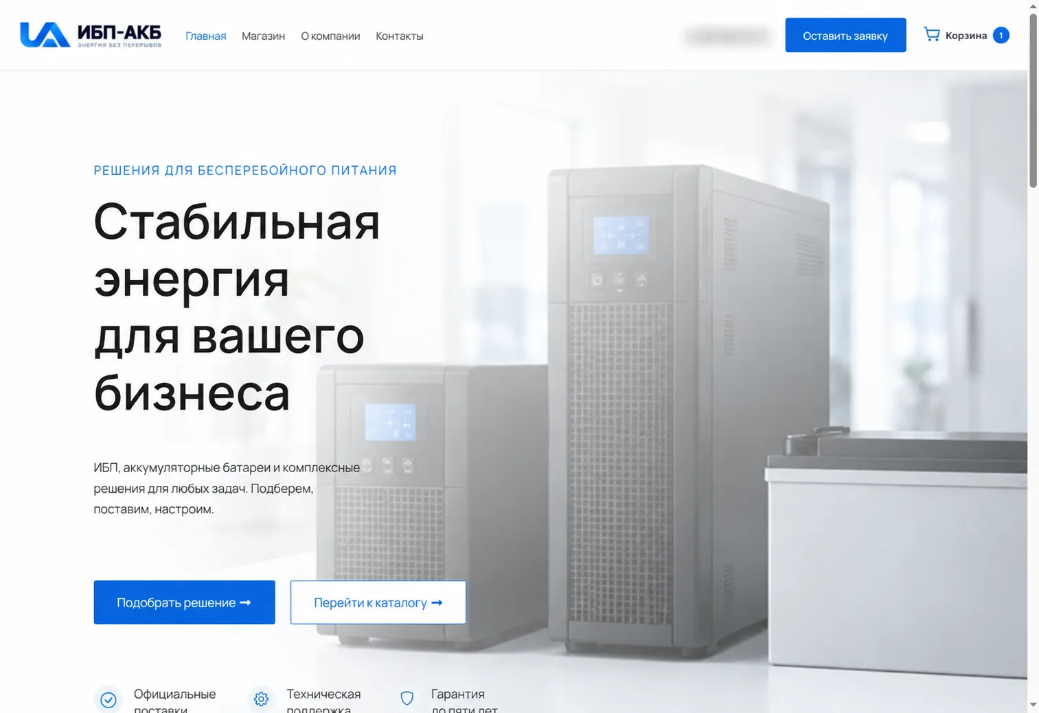
Logo and Visual Identity
For the new project, we designed the UPS-AKB logo and built a clean visual system around it: a light background, clear typography, and blue accents. This approach keeps the focus on the equipment and its specifications without overwhelming the page with unnecessary decorative elements.
The homepage immediately explains what the company does and presents visitors with two clear next steps: find the right solution or browse the available products.
A Product Catalog That Is Easy to Navigate
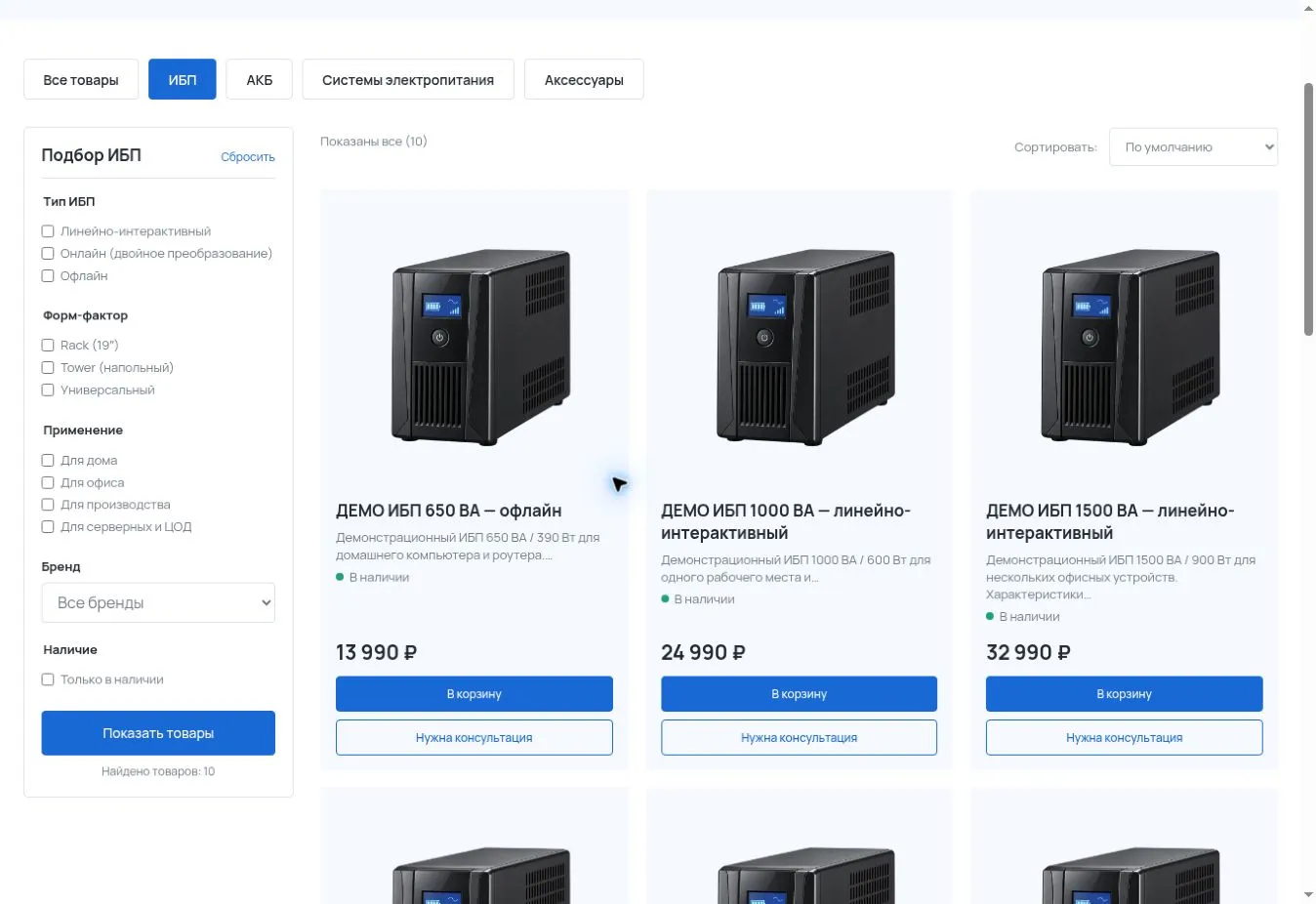
We divided the product range into UPS systems, batteries, power supply systems, and accessories. Each category has its own relevant filters. For example, in the UPS section, visitors can filter products by type, form factor, application, brand, and availability.
The catalog structure is also designed to scale: new categories, products, and filtering parameters can be added as the product range grows.
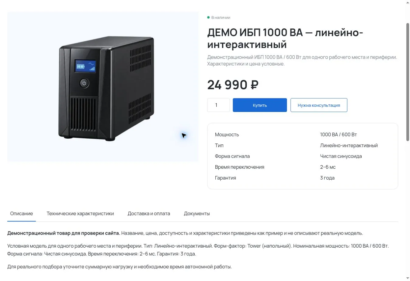
On each product page, the price, availability, and key technical specifications are displayed alongside the product image. Visitors can add the product directly to their cart or request a consultation if they need help confirming the right configuration.
Further down the page, they can find a detailed description, complete specifications, delivery information, and relevant documentation.
From Product Selection to Checkout
The website was built on WordPress and WooCommerce. In addition to the product catalog, we configured the shopping cart and checkout process to accommodate different purchasing scenarios, including local pickup.
For visitors who are unsure which equipment specifications they need, we also added a dedicated UPS selection request form. This is particularly important for technical products: a well-designed website should help customers understand and define their requirements before they make a purchase.
As a result, the new company received a complete foundation for building its online presence and managing its product range: a recognizable logo, a clear homepage, a filterable product catalog, detailed product pages, and straightforward paths to either purchase or request professional advice.
The screenshots were taken while the website was still being populated with content. Products, prices, and specifications shown are for demonstration purposes only; contact details have been hidden in the images.